Monday, April 26, 2010

Mother's Day Card

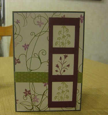
This is my very very simple Mother's Day card this year. Mother's Day in NZ is on May 9, so coming up in 2 weeks. Mum has seen all my cards, and I think I will surprise her with a simple one more than an elaborate one! Plus, I know that the clean image will appeal to her more than a fancy one.
This card is my entry for the Clean and Simple sketch challenge this week, and also the Pals Paper Arts challenge, which is to KISS - keep it simple sweetie. The Stamping Sisters in Christ challenge is to create a Mother's Day card, so it's also for that.

Cottage Wall Evening Dress

This is my entry for the Diva Coffee Break Designs sketch this week. I love the very feminine Cottage Wall papers, and they look perfect with the feminine, flowy dress.
I'm also entering it in the Hand Full of Stamps challenge, which is to use two pieces of DSP. In this card there are actually three, but only 2 on the dress!
The papers are Cottage Wall, the ink is Rich Razzleberry, the cardstock is Old Olive and Whisper White. The stamp is a lovely local one from Montarga in Christchurch.

Wednesday, April 21, 2010

Cascade Card

This is the first colour challenge I have entered! Finally I had all the colours I needed. The card is for the Just Add Ink Challenge 13.


I love the cascading card idea because it adds so much interest to the flat front surface. The stamps I used are from the Pocket Silhouettes set.

Monday, April 19, 2010

I'm falling apart!

I've been a bit busy recently - headcold, a blood test which hopefully WON'T tell me I have an infection remaing from my ruptured appendix, plus a tooth managed to crumble this afternoon...

With all these things going on, I knew I had to spend an evening crafting. Now I'm posting the photos, and then BED!

You will certainly notice a lot of similarities between tonight's cards. I love my new set of Stampin Up papers... thank you Helen! (My partner in the crafting asylum). So pretty much all the materials for the following cards are Cottage Wall DSP, Rich Razzleberry cardstock and ink, Old Olive cardstock and ink.
Firstly, Our Creative Corner's sketch challenge 11.
Here is my take on Taylored Expressions' sketch this week. (109) This is my favourite of tonight's sketches, and I'm also entering the card into the challenge at Stampin Sisters in Christ. The theme is Flowers. Mine are autumny.


Lastly, here is my card for the Pals Paper Arts sketch 38.

Wednesday, April 14, 2010

I don't really do ribbon...

I don't really "do" ribbon well (I will push myself to get it right one of these days) so here is my take on the Clean and Simple sketch this week.
Cardstock is Old Olive and Whisper White, with Chocolate Chip DSP. There is a hint of Old Olive ink sponged around the edges of the WW. The ivy stamp is a Montarga favourite which now that I use it I see needs replacing. That's got to be a first for me - but it is one I have used sooo much, I just couldn't imagine not having it in my collection.
Something I mentioned in one of my recent posts is that I would imagine most of the current challenges featuring leaves and flowers are being inspired by spring. Over here we are now surrounded by autumn, and my cards are reflecting that.

Baja Breeze pieced card

This is my entry for the Taylored Expressions Challenge this week. There are some really lovely sketches that I have been using from this site... what a talented lady!

Baja Breeze features heavily, along with some Not Quite Navy ink, Basic Grey cardstock, and Urban Garden papers. I am finding myself using the pocket silhouettes set time and again - it's becoming a firm favourite. I am loving stamping off the excess ink as part of my image.

Tuesday, April 13, 2010

Fleur's Place

We had such a fantastic time at Fleur's Place a few weeks ago, celebrating Victoria's 30th. I took lots of phtos and I knew I had to do something pretty special with them. Well last weekend I had my workshop in Christchurch and I taught the ladies how to make an Exploding Box album. Everyone's worked out really well. Into mine I decided to put the photos from our day at Moeraki. I used 4 colours of cardstock: cement, dark blue, cactus and brown. The papers are from the Seasons paper pack, unfortunately on the While Stocks Last list so I have to order more this week! Also some mini ABC/123 stickers for the title. In the way of tools I used my 12" cutter and scorer, corner roudner and scallop punch.
I am really pleased with the result. It's such a fab way to show off lots of photos,and I love the way it surprises people when they lift the lid!
I am entering my Exploding Box album into the Crazy Challenge this week - DON'T CALL ME FLAT!

Cascade Card

This is a simply fabulous idea which I have sooo loved using. I am entering it into three challenges this week. Pals Paper Arts' theme this week is flowers. Perhaps it is inspired by springtime in many parts of the world, and I am sure that most of the entries will reflect this season, but here we are decidedly autumnal and I wanted a cooler feel to the card. At One Stop Craft Challenge the challenge was "On the Move" - and I love the way the cascading flowers flip over. At Simple Doodles, their challenge is to inspire others, and the messgae here is "Take Care of Yourself".
Ingredients: All Stampin Up. Chocolate Chip DSP, Whisper White and Old Olive Cardstock. Chocolate Chip and Old Olive inks, Pocket Silhouettes set.

Tuesday, April 6, 2010

Larry Rivers

Well, I had never heard of Larry Rivers, but Scrap the Art are having some really interesting challenges inspired by works of art. Here is Larry Rivers' Rembrandt which inspired this card.


Why the dress? I'm not sure. I just liked the idea of seeing it in rainbow pieces. It's a very cute stamp though - another local Montarga one.

Paper Piecing

At One Stop Craft Challenge, the task this week is to use paper piecing to make a card. I used this gorgeous gal from Montarga and matched her shopping and dress to the background. I
really have to get into using copics to start colouring my images, but for the moment I think I am better to leave them white... the poor thing looks like she has a terrible skin disease after I've coloured her!

Monday, April 5, 2010

Mojo Monday Sketch


Here is my take on the Mojo Monday Sketch this week - just in time, I am hoping.

I love making easel cards. This one I wanted a little bigger than my others, so it is 5" square.


Colours: Baja Breeze and Not Quite Navy cardstcok with Urban Garden papers. Inks: not quite navy, baja breeze and basic grey. Stamps: Pocket silhouettes set, Vintage labels set.

Tools: CCS circle templates, personal trimmer, mini circle punch.

Sunday, April 4, 2010

Just Add Ink Wildcard

Thank goodness for Just Add Ink's wildcard this week! A chance to do whatever takes your fancy. This is a page I did with my neice Meegan's Ball photos. She looks absolutely stunning (Meegan is the one in black) and the Diva papers are great to show off the girly girl moments. Before you wonder about the "Just Married" sign, the theme was Las Vegas!
Ingredients: Creative Memories Fashion Diva additions: 12x12 papers, photo mats, embellishments and title stickers. Cardstock in lavender and purple. Delight paper buttons. Ebony mini ABC/123.
Tools: CCS oval templates, corner rounder and square punch.

Saturday, April 3, 2010

Bella's Truck

I made a couple more cards today based on the Twilight theme - it's the inspiration for Hand Full of Stamp's challenge this week. When I first saw the pickup set from Stampin Up it reminded me of Bella, and so it's a perfect choice for the Twilight challenge. I've used Not Quite Navy and Basic Grey cardstock to give the cards a night time feel, and have used the tree from the pickup set to make a forest image. I love using mini CDs to give some shine to the circular frame, and the moon in the top corner is a reminder of Jacob. On the second card I used the full moon as part of the main image.

The sketch is from Our Creative Corner's challenge this week.

Friday, April 2, 2010

Square Thank you

This card is for the Clean and Simple challenge this week. My camera works again!! I am still pursuing insurance for it though, because it is doubtful that it will keep going for long with all the water it has seen...

It's a lovely sketch challenge this week and I do really like this design. I have used, predominantly, Baja Breeze, one of my very favourite colours. The daisy sticks out from the card and the button adds a little bit of dimension. I don't have a scallop maker this big, so I used halved cirlces of Basic Grey.

Cullen Card

I love the inspiration challenge at Hand Full of Stamps this week - Into the Twilight! I'm definitely a Twi-hard, and I just knew I had to have a go at this one.

I wanted to use classic colours like black and silver (although the silver didn't make it), plus I wanted it to have a bit of a "dark" feel, I knew I had to use hearts, and I wanted some greenery because green is so much a part of the whole atmosphere in the book. I have also stamped the background with a Cullen crest stamp I had made up. The two hearts obviously symbolise Edward and Bella - one laced with black ivy and the other with green ivy.
I used the layout sketch from Diva Coffee Break Designs and I popped my hearts up to go with the Stampin Sisters in Christ challenge this week.